Building on our work on the Climate Coaster, the Australian Conservation Foundation asked Geoff Hinchcliffe and I to develop a web-based visualisation tool to communicate localised climate change impacts for a range of sites around Australia.
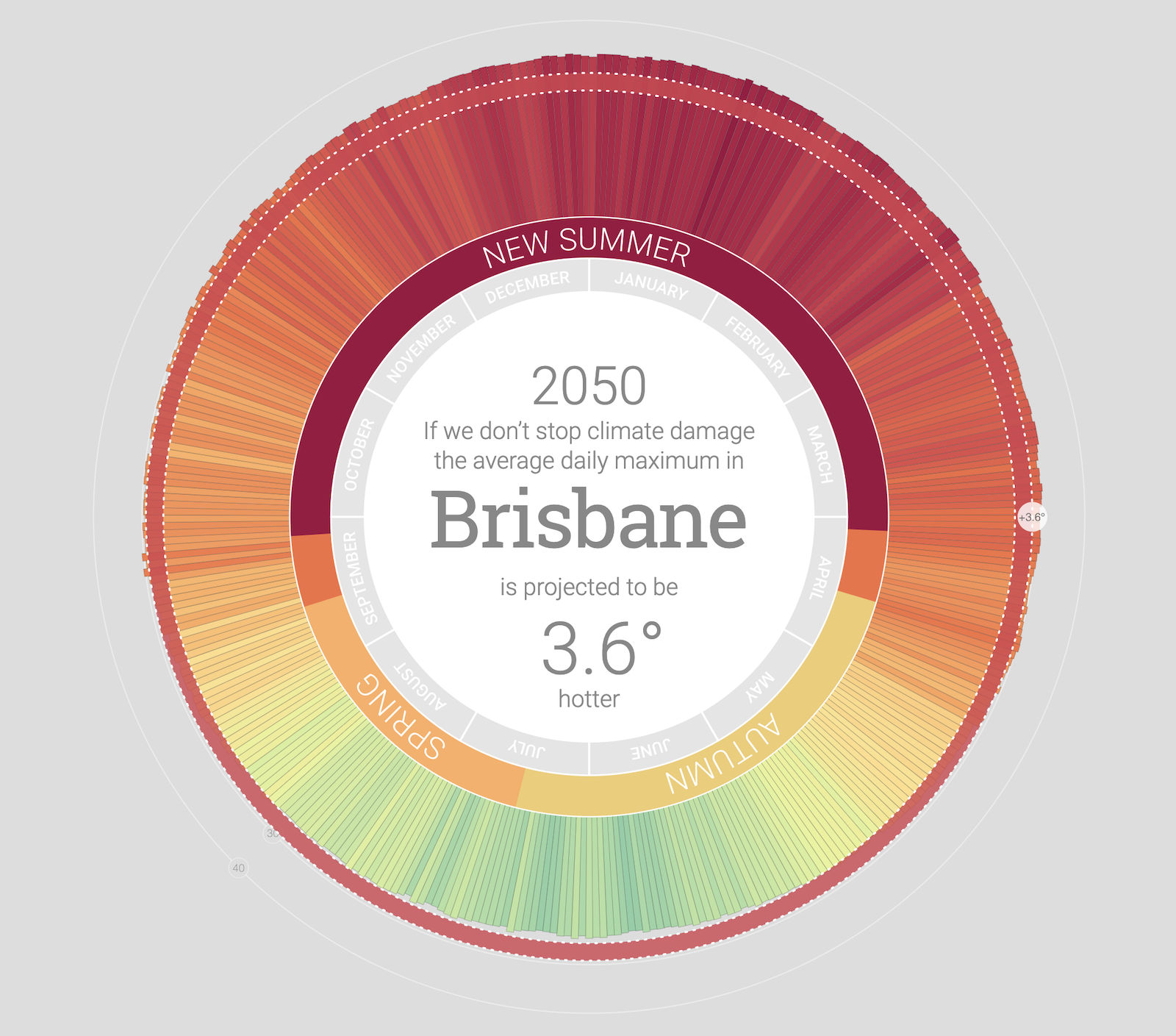
Working with a dataset of over 4700 projections from the Queensland Government's Long Paddock service, and drawing on advice from the ANU's Climate Change Institute, we developed an adaptable visual form that reveals changes including average temperature increase, summer extremes and changes to seasonality.
Alarmingly, in almost every location we see average temperature increases eliminating winter as we know it and creating a "new summer" of extreme heat sitting in the middle of an extended summer season. This extreme summer period will seem familiar to anyone who has encountered recent heatwaves in Australia. In working with this data we struggled with how to communicate change effectively. Using the familiar language of the seasons is a conscious strategy; with this detailed data, we can show how unchecked climate change will shift and distort seasonal norms.