This article looks at the current state of "data practice" in Australia and New Zealand through the work of four prominent creators, spanning visualisation, cartography and digital heritage. It was published in Artlink 37:1, Data Visual, edited by Ian Millis.
Our society has spent the past couple of decades rapidly digitising itself: migrating communication, commerce and culture into the network, and transforming everything it touches into data. The scale of “big data” is matched only by the hype that surrounds it. The Economist trumpeted the “Data Deluge” on their February 2010 cover: a businessman catches falling data in an upside-down umbrella, funnelling it to water a flower whose leaves are hundred dollar bills. Data has been called “the new oil”; fuel for the next boom, as the current one falls apart. We have every reason to be skeptical when big business and government sing its praises in unison, but for better or worse data is now tightly woven into our world. One of the key challeges for our culture at this point is to come to grips with data; to work with it, learn its language, question and apply it.
Visualisation has a significant role to play: data is obscure and intangible, and visualisation makes it concrete. As the other work in this issue shows, art is also a powerful actor, with license and latitude in how it can appropriate, transform and critically deploy data. But data art and visualisation are both instances of a broader field; what we might call data practice. In looking beyond the art world we can catch sight of data as a pervasive cultural concern, a material for making and scholarship, and a vector of engagement that crosses between disciplines. Designers, cartographers, coders, hackers, researchers, historians; across a patchwork of domains, data is at the core of an emerging set of creative practices. I spoke to a handful of prominent practitioners from Australia and New Zealand, hoping to develop a sense of this field and how it comes to grips with data as a cultural material.
Small Multiples
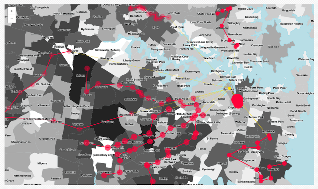
Sydney based studio Small Multiples are one of a handful of practices in Australia specialsiing in data visualisation. Since opening in 2011 founders Andrea Lau and Jack Zhao have grown to a team of ten. Their work for a slate of big media and government clients provides a snapshot of the emergence of data as a social concern as well as a material for new forms of creative practice. In an environment marked by a relentless simplification of political language and the dominance of spin, public data can provide a more complex portrayal of current affairs. News and media outlets turn to visualisation as a key element in an emerging “data journalism”. Small Multiples’ projects have addressed topics from asylum seekers to casino patronage, from treasurers’ budget speeches to energy efficiency in office buildings. In each case their work takes complex, multi-layered data and renders it for clarity and crucially, investigation. In their 2012 Census Explorer, produced for SBS, Small Multiples design a slice through our national stats that emphasises a diverse, multicultural nation.
The design is crisp and clean, the charts are bright, but this is much more than attractive styling; it’s an invitation to engage with the real complexity that the data reflects. The focus on cultural diversity is not accidental, and it runs through much of the Multiples’ work. Lau is second-generation Chinese Australian; Jack Zhao was born in Beijing. He says, “it’s a conscious choice to do more of these projects. There’s an intrinsic interest, and we live in a very multicultural city.” Data practice, in other words, is personal (and equally, political); the hand of the maker is clear in this work. In one independent project the studio looks at the bus routes operated by Sydney’s Star casino; by stitching together timetable data, maps, and cultural demographics they show how the casino buses target non-english-speaking migrant communities, where gambling is increasingly problematic.
A recurring strategy in this work is encouraging the audience to personalise their view. As Andrea Lau says, “the power of data is that you can see everything from a very local level; from yourself to your family or suburb”. This personal relevance is not the whole story; it’s a hook, a device for engagement to lead us into deeper investigation and comparison. This is crucial because Small Multiples produce work that demands interaction; Lau and Zhao call them “tools”. They offer us increasingly sophisticated control over our view of the data. In their Budget Speeches piece for the Financial Review we can sift two decades of promises and bluster from both sides of politics, honing in on specific terms, parsing the changes in political language over that period. We can hop from twenty-year overview to a single paragraph in a click. Calling these visualisations tools is perhaps misleading, for a tool generally has a specific purpose. These interactives are more open-ended, and thus potentially more powerful; rather than provide simple answers, they engage us in investigation.
Greg More
The rapid emergence of data as a social concern has run ahead of our cultural and technical literacy; this poses some challenges for data practitioners. As Andrea Lau of Small Multiples reports, clients bring their own interpretations of what visualisation can do, or jump too quickly to solutions before the problem is fully understood. Melbourne designer Greg More (OOM Creative) says that while the noise around data is becoming “louder”, “I don’t think it’s got clearer.” “People see it as something that’s more efficient. It’s about being very fast, and that’s what they see as value. But generally the projects I work on are more about broadening people's understanding of data, from being something purely functional and efficient, to something that is cultural ... or challenging — it makes you think differently about the situation.”
More’s Urban Forest Visual project is a case in point. Developed for the City of Melbourne, the project maps more than 70,000 individual trees, including species and expected lifespan alongside location. The site also outlines city’s challenges and plans in managing the forest: many of the plane and elm trees are nearing the end of their lives, and a major replanting program is underway. It’s a powerful visualisation, and again it unpacks real complexity in a beautiful and engaging form; but as it emerged this functional efficiency was only part of the story. The site includes an option to email the city about a specific tree, intended for reporting damage or other concerns. Instead visitors took it as an invitation to address the trees themselves. Thousands wrote messages of thanks, concern and appreciation. Some asked about current affairs, or details of tree gender; city staff wrote back, in character as the neighbourhood elm or oak. The project garnered a flurry of attention online, much to the City’s delight; but more importantly it revealed the strong attachment between Melburnians and their forest. As Melbourne University urban ecologist Dave Kendal writes, there’s more to trees than what they can do for us, what “ecosystem services” they provide; we often love them simply for being themselves.

As More says, the Urban Forest project creates “hooks” between digital and physical spaces that foster new dialogs and feedback loops; but these connections are designed, rather than given. More’s background in architecture and spatial design informs his data practice: “it comes from an interest in environments, and how information exists within environments … it’s fundamentally thinking about the spatial dimension of information, and how people use it.” In More’s Data Tapestry project, commissioned for the NGV’s 2013 Melbourne Now exhibition, a diverse stack of urban datasets are woven together across a wall of screens: waterways, traffic accidents, telecommunications networks. The approach here is cinematic; data layers unfold and flicker, we pan across city blocks and pull back to reveal the whole metropolis. A neutral voice announces each dataset in turn: More describes it as a “departure lounge”, a sense of “data arriving and departing”; it’s a performative rendition that emphasises the dynamics and flows of data; its sense of liveness, as well as the very urban exhileration of sheer scale.
The temporality of data is also central in More’s White Night Data Tower, an installation created for the City Library during the 2015 Melbourne White Night event. It renders a textual stream of data pulled from social media, pedestrian traffic counts, library loans and more. Once again the focus is environmental, though rather than map or represent space, the wall is about embedding data within it; More describes it as “a form of placemaking”. It’s also intentionally “slow data”; counting down over the week preceding the White Night and developing gradually over that period. It’s about “tuning” the display to its library context: “sometimes that means making it more passive, rather than attention-seeking.” Along with Data Tapestry this project also extends data practice beyond simply visualising a given data source; in both these works data is actively selected, curated and juxtaposed and these choices — points of connection between data and its sources in the world — are formative.
Chris McDowall
Digital maps are ubiquitous now, in data visualisation as well as our networked everyday. Developers and designers often use the term “base layer” to refer to that draggable Google Maps frame — and indeed it’s taken for granted as a stable foundation, a neutral geo-spatial base to build on. So it’s easy to forget that maps too are data visualisations, designed representations that show some things and hide others. The work of Auckland digital cartographer Chris McDowall shows how maps can be made and remade as platforms for poetry and exploration, as well as navigation.
I find the map such an evocative artefact. Maps say things about places and cities and nations that we don’t have any other means of articulating. Nothing else has that explanatory power… it says things that photography, writing, painting and statistics are silent on. [A map] enables the reader to explore a space in a nonlinear way, which is actually really unusual. Probably the closest you can get is something like Wikipedia; but what maps have is cohesiveness; they are made up of small interconnected parts that constitute a whole thing.
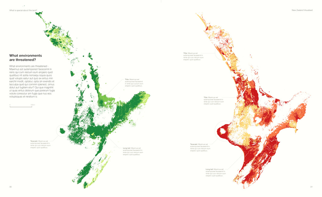
In his current work McDowall uses digital cartography to generate intricate maps that are both cohesive and unfamiliar. In one spread from his forthcoming book on visualising New Zealand he maps the North Island by native vegetation and environmental protection, using data from Landcare Research. Rather than float these datapoints over a familiar base layer, marked with borders, towns and roads, McDowall builds the map itself from the data, but then peels it apart, splitting the landscape into a jigsaw with ragged edges and gaping holes. The archetypal wholeness and integrity of the landscape is divided; a metaphorical gesture that echoes our own troubled relationship to the Anthropocene earth.
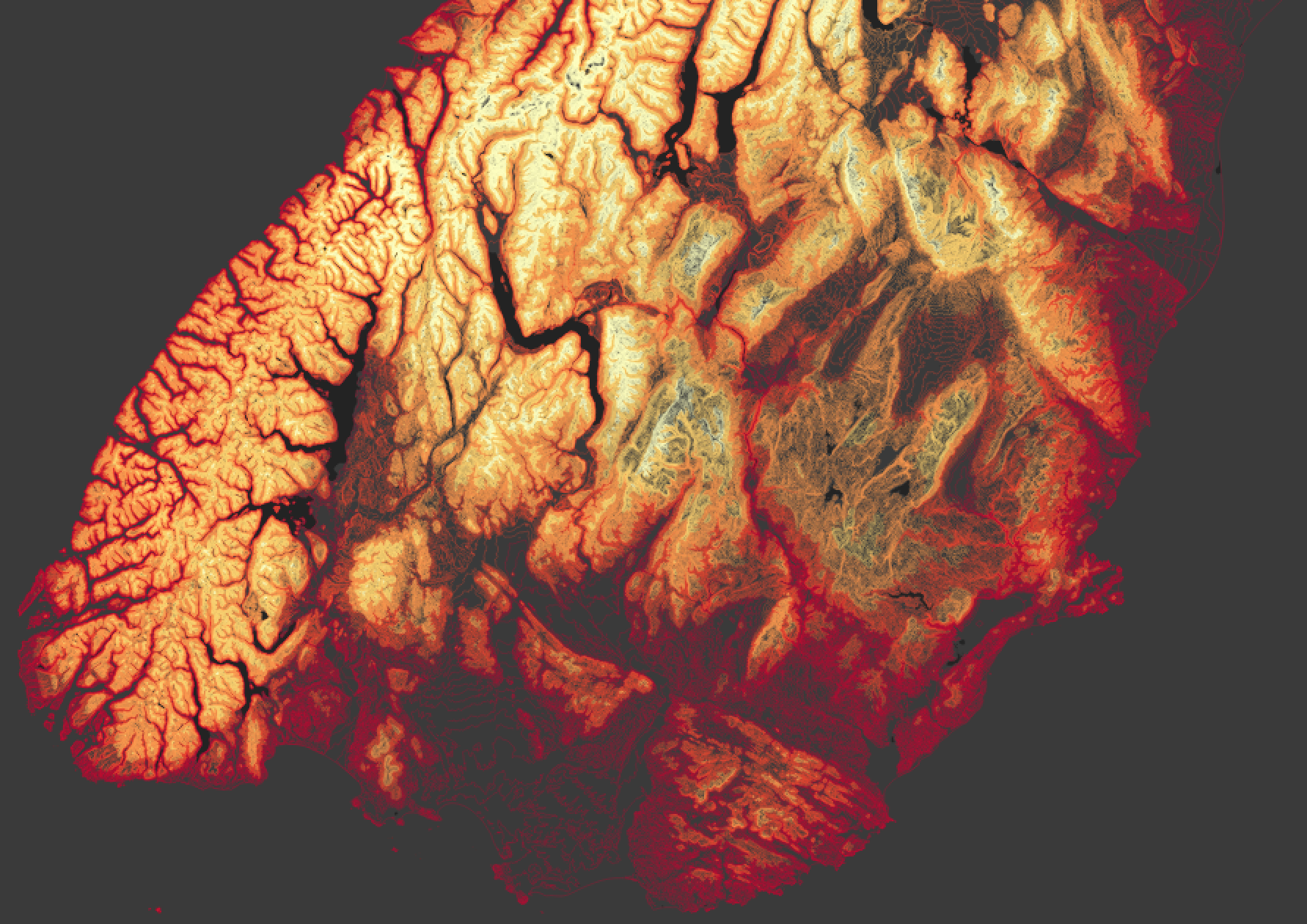
In another design for large prints McDowall works only with contour data, building up the map from cartographic marks coloured in blood reds and fleshy ochres. The landscape becomes a body: the fjords of the South Island read as brain-like folds and wrinkles; the rivers are arteries; the tablelands gauzy, translucent sheets of skin. The data here is not new — it forms the basis for other more recognisable maps — but McDowall’s careful rendering transforms this terrain. He says, “I worry that New Zealanders, when they see a map of New Zealand, don’t actually see it; it’s so familiar. I wanted to emphasise the structure of the land and the topography, and present it in a way that’s unfamiliar so that the interested viewer can unpick it. I’m seeing things afresh; I know the landscape so well, and yet I don’t. It’s opened up the landscape for me.” These visualisations are both evocative and accurate — a signature combination for McDowall, who started an Auckland data visualisation meetup called the Data Poets’ Society. “In the last couple of years I’ve been interested in emotional responses to work. For something to be data vis it needs to have a fidelity to the dataset; I’m also interested that we can create depictions that mislead as little as possible; but what’s it going to make people feel?”
This approach is akin to what designer Georgia Lupi has recently termed “Data Humanism”. Reacting to a flood of infographics, the rise of big data and “the impersonality of a merely technical approach,” Lupi’s manifesto instead celebrates the small, the imperfect and the subjective; she suggests we depict complexity, rather than simplify it. Echoing Greg More’s comments, she calls for slowness rather than speed and efficiency, and for a recognition of the human reality that our data represents
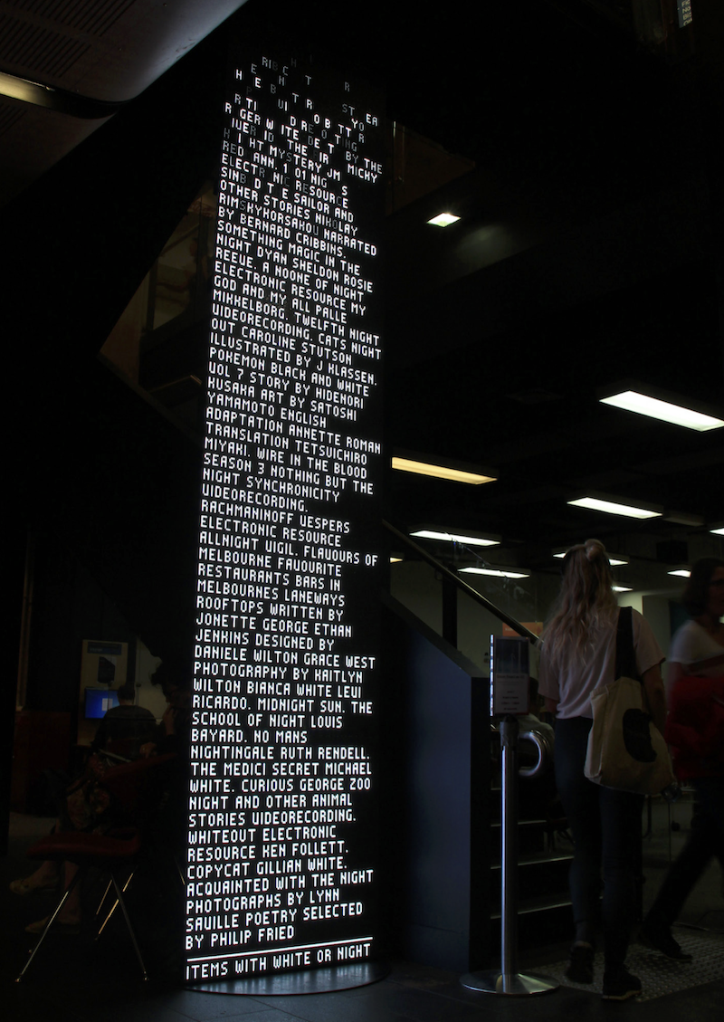
Tim Sherratt
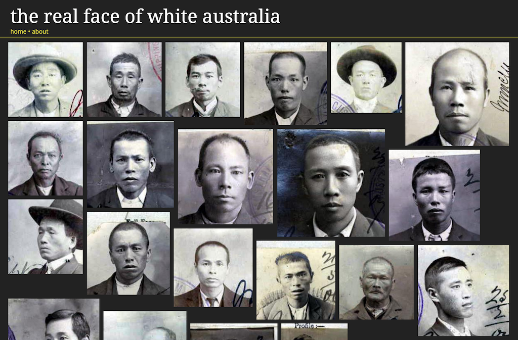
Lupi’s philosophy also describes the work of Tim Sherratt, a digital historian who works with archival and cultural data. Where contemporary visualisation tends to celebrate an increasingly data-rich present, Sherratt mines datasets that bear the complex, messy and very human traces of our past. His Invisible Australians project (with partner Kate Bagnall) investigates the history of the White Australia policy through the bureaucratic traces of discrimination and exclusion that remain in public collections. Sherratt harvested tens of thousands of digitised files from the National Archives: documents and certificates that show oppressive government policy in action. But in exposing these records, Sherratt focuses on the people, rather than the system. He uses open-source image analysis code to automatically crop these images down to individual faces, then pours them out into a webpage, thousands and thousands of them. Instead of lists of government records, we see people; thousands of real, individual Chinese, Malay, Indian or Syrian people. This is a long way from conventional data visualisation, but that’s unquestionably what it is. Sherratt takes public digital records and deliberately transforms our view: “it’s a counternarrative: instead of the portraits of the famous, it’s portraits of people who were oppressed in various ways through the operations of the White Australia Policy — it’s hoping to invert that idea of the portrait gallery.” Once again data here carries an unexpected emotional charge. “We’ve had emails from people saying they were in tears,” Sherratt says, though “it’s not what we set out to do. We knew the records were powerful, but it was just an experiment — and that’s where it comes back to ideas of practice and working with data.”
Sherratt refers to himself as a “historian and hacker”: while the term has recently taken on criminal connotations Sherratt uses it in its original sense. Hacking here is about digital literacy, sharing tools and data, and a healthy disrespect for conventional solutions and technical obstacles. It’s a practice; a situated, hands-on process of experimentation, learning, speculation and investigation familiar to any artist. It is also highly independent; and Sherratt’s practice is a positive demonstration of the distinctive mobility and malleability of data. Access to data is a prerequisite for data practice: open data is a noble ideal with increasing backing in the public sector, but in practice it’s rarely simple. Like many public institutions, the National Archives does not make its data readily accessible; it publishes digital records via a rudimentary web interface designed for human researchers, not data-harvesting machines.
For the hacker historian this is only a minor obstacle; Sherratt writes software to “scrape” information from the web pages in bulk, harvesting the masses of records that enable Invisible Australians and his other projects. He recently turned a similar process on the Parliamentary Library’s digital Hansard archive — containing the transcripts of every Federal Parliament since 1901 — and republished it in a more open and readable form. “I harvested all those gigabytes of Hansard files, and in the process found that they were missing about 100 sitting days. To their credit they have fixed it — and to me that’s one of the reasons to do it: understanding what is there … whenever you do anything with data, that’s when you find the problems.” Sherratt says “Access is a struggle. We have got to conceive it as that; it’s not something that institutions give away, we’ve got to take it. That’s why I do what I do; it’s testing the boundaries of what we mean by access all the time.”
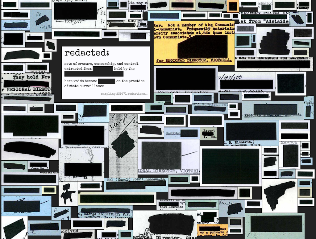
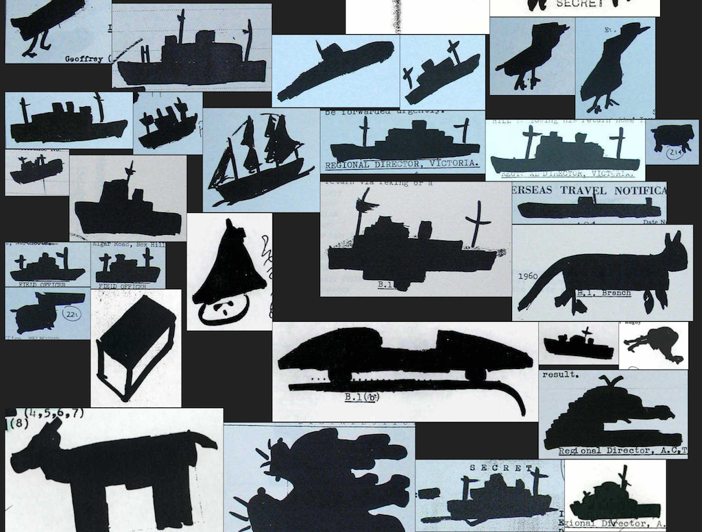
This question of access drives Sherratt’s most recent work; Closed Access investigates those parts of the National Archives that we can’t see; they have been withheld for reasons of national security or the protection of individual privacy. Sherratt describes it as “reversing the gaze” of government surveillance. He traces this gap in the archives methodically: “the metadata allows us to see what we can’t see — we can colour in all around it to see what’s left.” Interactive visualisations reveal the shape and scope of this negative space in the public record. Digging deeper, Sherratt also mines the visual signatures of censorship and erasure. Open With Exception harvests some 300000 pages from partially redacted Archives files. A computer vision script then identifies the redactions themselves, giving us a rich, fine-grained view of exactly what’s withheld from us. Once again Sherratt finds the humans in the bureaucratic machine, uncovering a genre of “redaction art” in the archive, as bored security operatives embellish their erasures, doodling dogs and battleships on their surveillance transcripts. As Sherratt says, “the interface ... becomes an access point. I’m turning it inside out — instead of being a dead end, [this data] becomes a starting point.”
As I write in late 2016, Australia’s Productivity Commission is running a public inquiry into “Data Availability and Use”. It will “investigate ways to improve the availability and use of public and private sector data”; laudable, if a little dull. The key points of the draft report hail “extraordinary growth” in data availability, and call for a new national framework to promote data sharing. But to what end? The answer is interestingly speculative: “opportunities ... are largely unknown” until “data users” get their hands on the stuff (ref). In other words, it comes down to the hacks, experiments and initiatives of practice. The push for a more digitally-enabled “Government 2.0” has seen various public data sharing initiatives emerge in recent years, inspired by a similar faith in the unknown potentials of data. Weekend “hackathons” like GovHack are the focus: gather teams of data-nerds and developers, offer prizes, lay on energy drinks and pizza, and watch the innovation blossom! Many of the practitioners I spoke to questioned this model: as Greg More comments, “hack days motivate people to engage in the data, but they are very short term”; Andrea Lau observes that government has been running the same format for “six or seven years” while “expecting a different result”. On the potential uses of open data, More says “it’s a long-term play: you don’t instantly get the context around open data that you want”; he also questions the identity of the “data users” that the Productivity Commission calls out. “Some people will use it more than others — and it’s hopefully not just real estate companies ingesting all that information and advancing their models, but people who can use it for more civic-minded activities.”
This question is crucial, and it relates directly to the diverse and nascent data practices outlined here. In an economic rationalist model there’s no reason to expect anything other than a privatisation of the public good of data; it will be fuel to the fires of jobs and growth — or more likely to the wave of “digital disruption” currently radiating outward from Silicon Valley. But as these makers show, there’s more at play here than the profit motive. Studios like Small Multiples are building successful businesses on data, but their practice is fundamentally concerned with engaging the public in complex issues. As all this work shows, data practice is cultural practice; it’s situated and embedded in frameworks of value, aesthetics and meaning that defy any simple bottom line.
Works like Greg More’s Data Tapestry celebrate ambient contemplation or playful juxtaposition; data here is a cultural material, rich in possible interpretations and emergent aesthetics. In More’s work as well as Chris MacDowall’s digital cartography, visualisation is a medium for reflection, a way to both represent and intervene in the landscapes we live in. Tim Sherratt’s work extends this to the historical domain; again, exposing complexity and contingency, asking us to reconsider what we might think settled. In all of these cases too, data practice is personal. It reflects specific concerns and specific points of view; following Lupi’s Data Humanism manifesto, it is subjective, rather than impartial. It engages feeling, as much as thinking: in transforming landscape contours into fleshy folds and snaking vessels Chris MacDowall is reconfiguring affect rather than making an argument. In seeking out the faces of the oppressed in the archive, Tim Sherratt turns data into an engine for empathy.
In other words this work is immensely productive, though not perhaps in the sense that the Productivity Commission anticipates. As well as its specific engagements and investigations there’s a wider issue at stake in this practice. While the cultural discourse around data and its value has, as Greg More says, never been louder, it remains fundamentally obscure in practice. As Small Multiples observe in their clients, we have only a vague sense of what data can do; it’s malleable and mobile, mediated by black-boxed computational processes. We don’t yet have either the technical literacy or the cultural toolset to come to grips with it. Data practices are crucial because they are a form of public exploration and experimentation, testing and demonstrating of the capacities and potentials of data as well as developing conversations and communities around practice and process.
In 2002 Lev Manovich outlined what he called the “built-in existential angst” of digital media; what he terms the “mapping problem”. Digital data has no intrinsic, tangible form. In itself it does not look, feel or smell like anything; it’s a set of abstract symbolic relations that can be mapped or translated into anything. Sound or image, graph or object; the problem for digital media, Manovich says, is that all these choices are equally arbitrary. Yet it’s easy to reframe this angst more optimistically: the potential space of data representations is wide open, and as the work documented here shows, an emerging cohort of makers, designers and hackers are moving into it. Their mappings — the representational and aesthetic choices they make — are not arbitrary, but grounded in and shaped by specific cultural fields and contexts, specific interests, concerns and demands. Data practice is what happens when the mapping problem — the anything at all of data — meets the complexities of everyday culture.